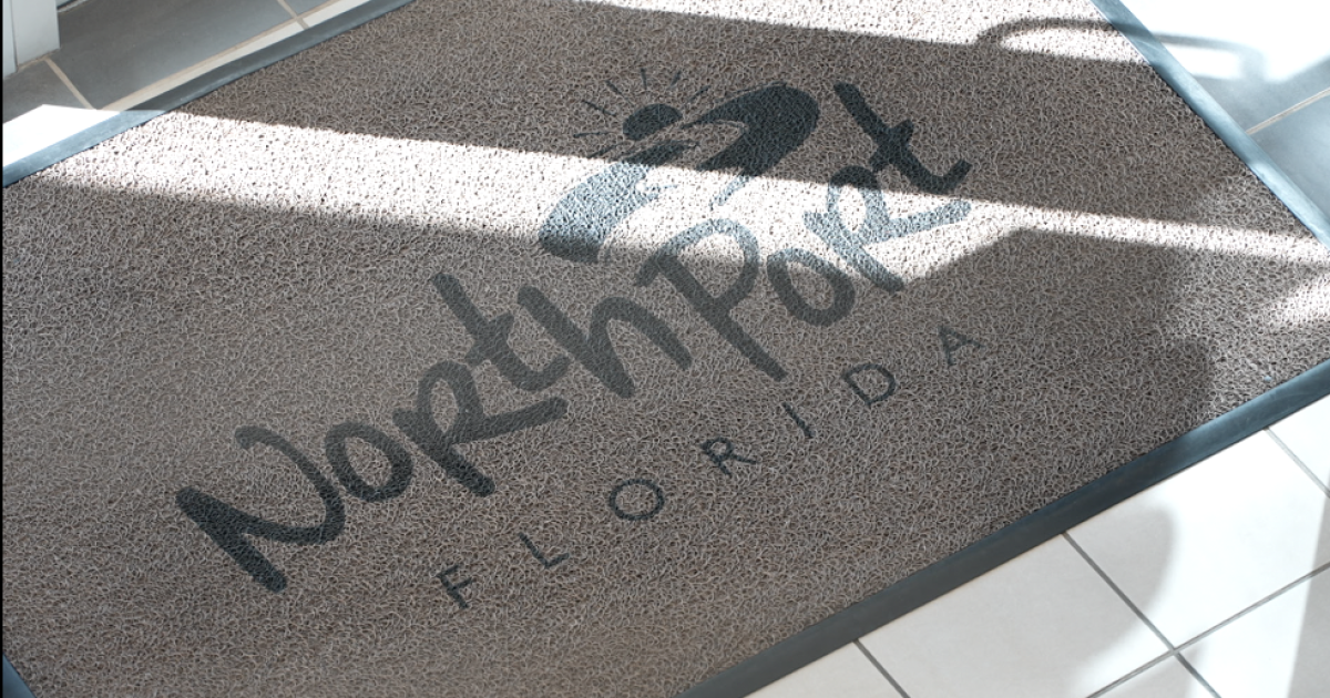
North Port is on the verge of changing its identity with a brand-new logo and tagline, thanks to community feedback that echoed the need for a fresh look as the city grows. The current logo, dating back to 2008, feels a bit outdated with the population skyrocketing from 60,000 to over 97,000. City leaders will make the final decision on February 10, after gathering insights from residents through social media, surveys, and focus groups.
This brand refresh is no small feat, costing around $25,000, which is a fraction of previous logo redesigns. While the city won’t rush to replace every logo on uniforms and signage, the new design will be gradually introduced—a practical approach given the city’s fiscal responsibility. As Marketing and Engagement Manager Katya Sutherland noted, the redesign emphasizes North Port’s natural beauty, community spirit, and transparency, reflecting values that residents hold dear.
While most of the public feedback has been constructive, the designs did receive their fair share of criticism online. Some passionate locals voiced their opinions, proving that a logo isn’t just a design; it symbolizes how a community sees itself. With a couple of taglines still in development, all eyes are on what will emerge from North Port’s creative effort. Will this new look shine as brightly as the sun, which inspired one of the popular designs?


